
Center for NYC Neighborhoods
The Center for New York City Neighborhoods (The Center) is a non profit organization that promotes and protects affordable homeownership in New York so that middle – and working-class families are able to build strong, thriving communities.
Our goal was to redesign The Center's website to clearly show how they help New Yorkers and to direct homeowners who are in danger of loosing their home to get help the help that they need.
Asking the right questions
When The Center came to SMAKK in June of 2016, they wanted to update their website so that it better communicated what they did and how they catered to New York City residents. With people using their site in a time of distress, it desperately needed to be a destination where people could come and quickly find the answers that they need and, most importantly, get help. We made it our mission to understand who was using the site, why, and under what circumstances. To do so, we conducted interviews with the people who work directly with homeowners, the hotline respondents. From these interviews, we discovered the following:
1. We needed to clearly explain what the Center does
2. Our users need to be able to easily navigate through the site
3. Users needed to be able to easily contact the Center
Laying it all out
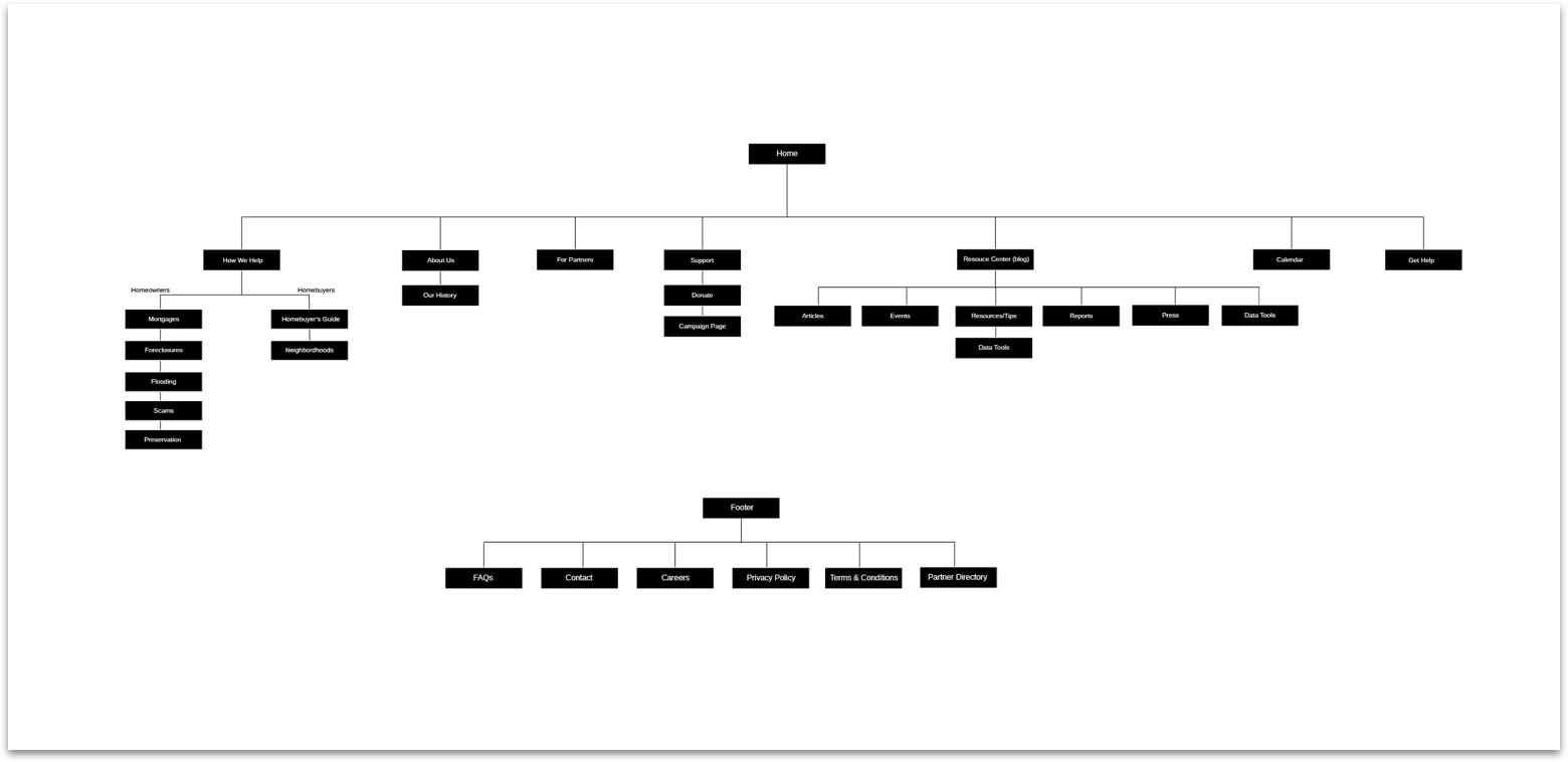
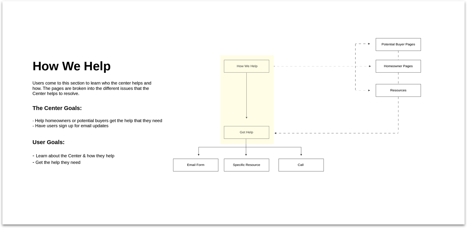
When it came to designing the architecture of the site, my focus was on creating a simple, intuitive structure that encouraged users to move fluidly throughout the site. The two main areas of the site became "Get Help" - a button that lives in the navigation of every page and "What We Do" which leads to subpages that explain each of the focus areas in great detail, as seen in the sitemap below.
Moving through the site
After finalizing the pages that needed to exist on the site, we thought about how the user will enter and how we can move them around to help them best achieve their goals while also considering the Centers'.
Content that's actually helpful
Once we knew the pages that needed to exist and how our users would navigate to these pages, I began to think about content organization and hierarchy and, moreso, how we could better help to explain exactly what the Center does.
I dove into brochures, government websites, and articles on topics like foreclosures, mortgage distress, scams, and flood insurance and felt myself quickly overwhelmed with what I encountered; a ton of information riddled with complex legal termononolgy that I had never heard and sterile language that put me to sleep. I thought, if I feel this way simply researching these topics, then people who actually needed this information to keep their homes must feel hopeless. Thinking about those people genuinely upset me and I knew there had to be a better way to talk about these processes' and issues.
Then I had a thought -- why did it need to be so complicated? Why couldnt we implement best practices typically used on marketing sites like first person testimonials, icons that would signify, and charts and graphs. From there, I got back to the drawing board and began to sketch out content modules that would be used across the site.
From concept to reality
Knowing the content modules that we were building with, the site began to come together. I worked to put those modules to use, designing wireframes that brought concepts to life and implemented a hierarchy that not only felt natural to users, but worked to simplify the content.
I created a clickable prototype that took our client through the experience of the website. This also helped them to visualize the content strategy in which we implemented throughout the site to tell the full story of the different processes.
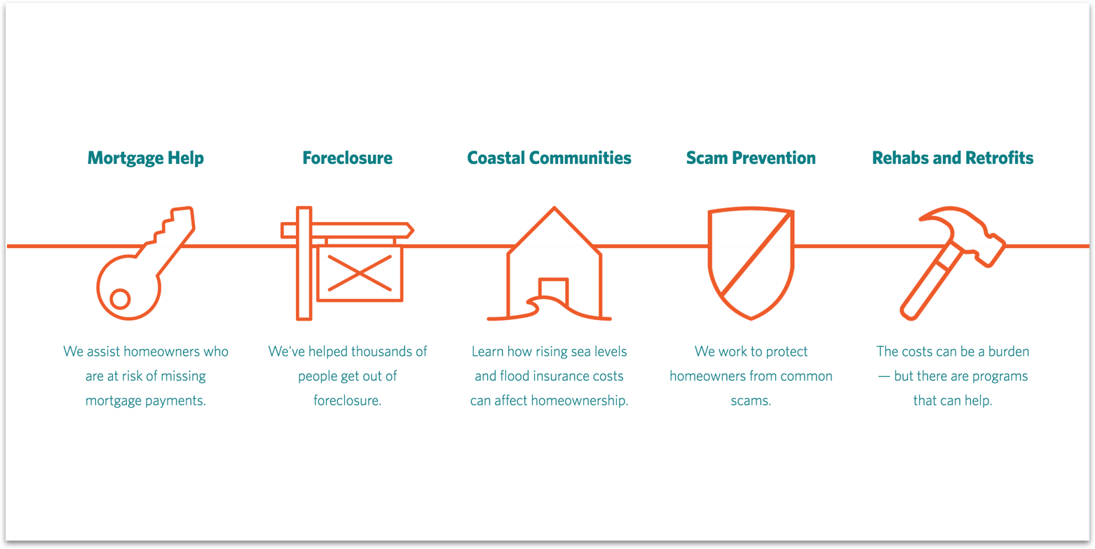
Forming a visual language
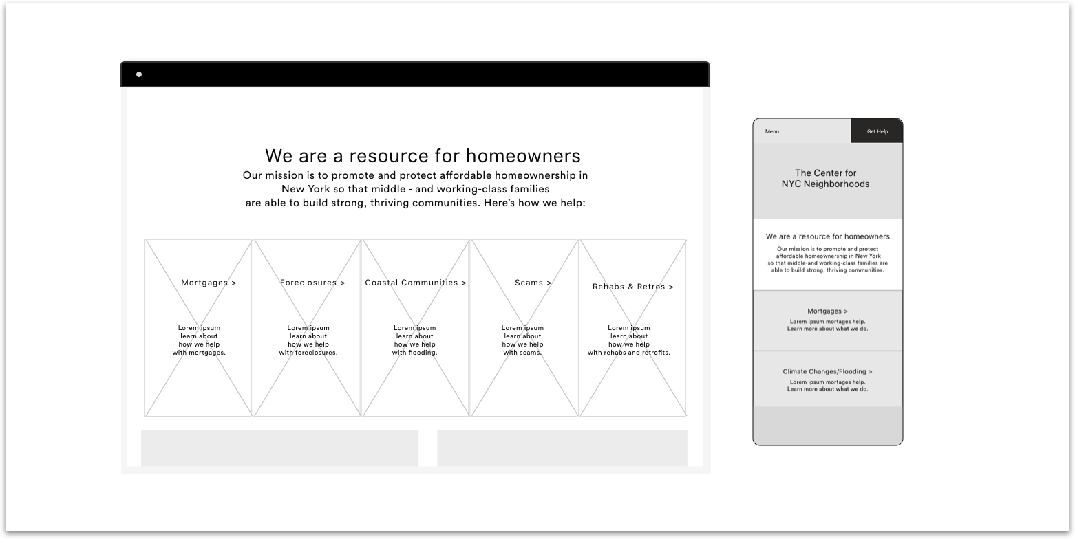
Given the complicated nature of the site and content, I knew it was important to keep the navigation very simple and create consistency using icons-- so that users would know exactly what the Center does and where to get the informtation that they're looking for. The How We Help page outlines all of the major areas of the site in a fun, interactive way.
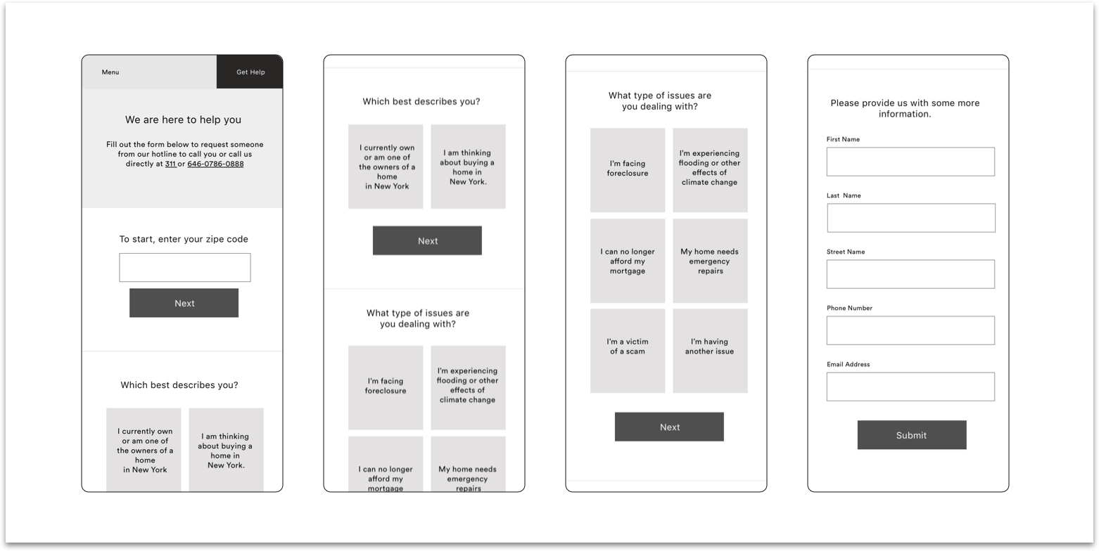
Getting Help
Though it was important to clearly show what the Center does, we never lost focus on the real goal -- getting homeowners the help that they need and we did this via the Get Help button. For that reason, we included it in the navigation, so that it was always front and center. Once we get our users to the Get Help page, we created a simple, 3 question form for users to complete.
This was form not only gave homeowners a sense of ease, but also helped to streamline the working process of the call center operators. Once users submit their responses, the information becomes plugged into a salesforce spreadsheet where operators can better understand what resources the homeowner will need before their initial phone call. They're also more easily able to manage contact and follow up information.
The results were twofold: not only did the site redesign make it easier for distressed homeowners to understand what the Center does and to get help, but it also creates a seamless intake process for the people working at the call center. In turn, this allows them to be more efficient and therefore, help more people.